Evaluation and Reflection:
Visual Communication:
- In what ways does the visual communication/message of the piece meet the needs of the brief? I think my project meets the visual communication of the brief and I have followed what I set out to do in my proposal. In my proposal I stated that I wanted to create a mental health awareness campaign featuring outcomes such as slogan, poster, video advert etc. By completing these outcomes I have fulfil the briefs requirements of visual communication.
- In what ways does the visual communication/message of the piece fail to meet the needs of the brief? I would say that my project does fail to meet the brief, I had all my final campaign elements ready for the hand in date as well as completing all the tasks I set my self while also being able to directly target my set audience.
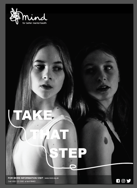
- What are the strengths of the visual communication? Why? I would say one strength of the visual communication of my project is that the design flows throughout all elements of my campaign giving my project a continuous theme. This gives my designs a more professional feel to the campaign also adding to the effectiveness of the visual communication.
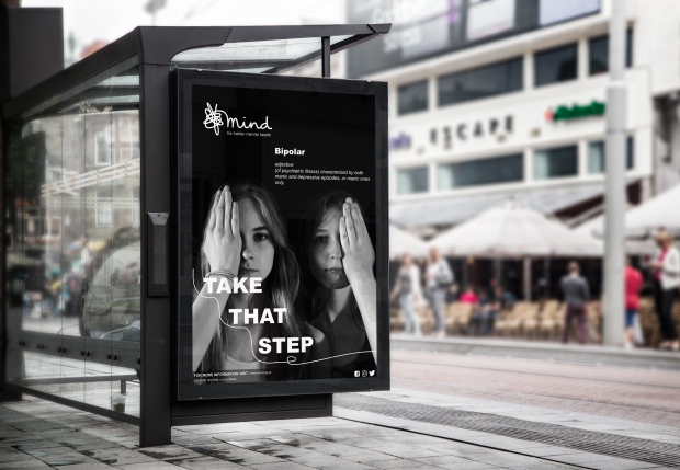
- What are the weaknesses of the visual communication? Why? I would say one weakness of my visual communication would be the use of typography. After the last crit we had Sancha mentioned that maybe the typeface I used for my slogan might have looked better in lower case rather than upper case, however, I was unable to change this in time for the hand in as I had already sent some of my work to print and I didn’t want parts of my campaign having different slogans so I decided that I would keep all designs the same as overall this would have a better effect.
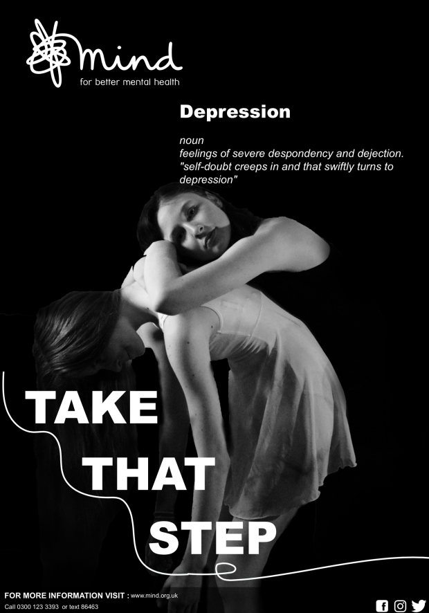
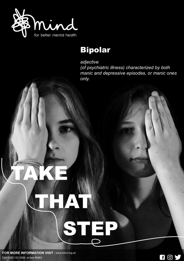
- In what ways could the piece be mis-read or mis-understood by the audience? Be specific about who the audience is. Throughout this project I’ve tried my hardest to make sure people viewing my work find it clear and easy to under and lowering the chances or confusion and miss understanding. I’ve clearly placed the Mind logo at either the top or the bottom of the page in a colour that stands out from the background colour. Furthermore, I added dictionary definitions of what poster resembled which mental health illness, however there will always be someone who views your design in a different way.
- In what practical ways could the piece be developed or improved? Designs are never perfect, they can always be improved. I would love to have been able to spend more time on my posters and maybe create more than for representing more mental health disorders. I also wanted to create another advert but more interactive with people try to see what common thoughts and ideas that are related with mental illness and what we can do to end them.
Reflection of own working practices:
- How was my time keeping? I think my time keeping was very good, in my head I planned out what parts of the project needed to be done by a certain date as well as allowing time for the creation and printing process. I didn’t have to rush towards the deadline as I was more focused and learnt from previous projects.
- How was my analysis of the brief? I feel like my analysis was pretty good, the brief was quite open ended and having to set your own learning outcomes and themes is quite a hard thing to do and to stick by decisions you’ve made.
- How was my research? I did in-depth research about mental illness such as the different charities that exist, researching the symptoms and effects of what having a mental illness is like, looked at other mental health campaigns and how the pitched themselves etc. This really helped me when it came to the idea generation stages and I had so much inspiration and ideas flowing it just made the whole process so much easier.
- How did I draw conclusions from my research? From my extensive research this allowed me to draw conclusions from it, looking at what type of design is typically used, where logos are placed and where people can get help. This was also somewhere to reflect back to if I got stuck further during the project.
- How did I use research to generate and develop ideas? Like I mentioned above my research helped the development process dramatically as it got the ball rolling and gave me so much inspiration to start creating my own design while also helping to build on existing ideas and designs.
- How did I use evaluations to help with my ideas generation and development? The use of evaluations throughout a project are vital as it allows you to reflect back on your work and independently review and develop your own work. It efficiently creates better designs and also helps you take a step back and have a clear view on what your designing.
- How did I use experimentation during the project? How can I make this more effective? I did a vast amount of experimentation during this project from sketching, to photography while also experimenting with film as well. I experimented by using new project and also made responses to artists work I had seen which inspired me.
- In what ways did I show that I had achieved the Learning Outcomes? How can I improve this next time? The Brief states ” Developed skills of independent study, resource utilisation, problem-solving and decision-taking”, I think I have successfully achieved this as I have mention previously I independently taught myself how to use new softwares as well as doing large amounts of independent study as such filming and doing video shoots outside uni etc.
- What parts of the project did I enjoy most? Why was this the case? I enjoyed the whole FMP project, and i think the reasoning behind this is because it’s your own chosen subject and theme so there has to be a slight passion behind it. I found my mental health campaign very interesting and I enjoyed working in a range of different media and mediums. It develops your skill as a designer and your ability to try new things.
- What parts of the project did I enjoy least? Why was this the case? I always find the printing process the most unenjoyable part of the whole project as it always takes so long and the printer usually stops working or something. I find it very stressful and takes up so much time.
- What areas inspired me? Why was this the case? How could I follow these up? I think because I suffer from Anxiety, the whole mental health awareness really interested me, I liked reading about other peoples stories about suffering from mental illness and helping to not put labels on people. I loved being able to express myself and my research through video and photography as it’s something I really enjoy.
- What areas were challenging or difficult? Why was this the case? The learning of new software having having to teach yourself how to edit a video was very difficult and challenging but at the end so rewarding.
- How can I go about developing and improving the parts I found difficult? This can be solved by using the software more and being more daring with my future designs and ideas.
Good Design Evaluation:
- In what other ways have you considered the sustainability of your project process and outcomes? The sustainability of my outcomes always comes across my mind when it comes to printing, this time when I was printing my poster I realise that I was using so much black ink! I also did various amounts of test prints so I would have to say that I didn’t put sustainability into consideration and this defiantly something I needed to improve on
- In what ways have you considered the ethical implications of your project process and outcomes? Due to mental health being such a popular topic at the moment I had to be careful on what I said on the subject . As a designer you have to consider what issues you cover in your work don’t have a deviating impact on your name as a designer. As I feel very strongly about this subject as well as doing a lot of research I felt like I was confident with what I was portraying and how I went about it.
- In sustainability and ethical terms in what ways was your work in this project an improvement or a backward step for you as a socially conscious designer? I wouldn’t say it a step forward or a step backwards, I feel like I’m the same as I was last project which gives me a goal to set myself for my BA year.
- What targets can you make at this point for your work in the future as a socially conscious designer? Consider sustainability of my designs and the materials I use, be socially aware of current affairs and news thats happening in the world as this will allow you to be more ethical and understanding.