Visual communication:
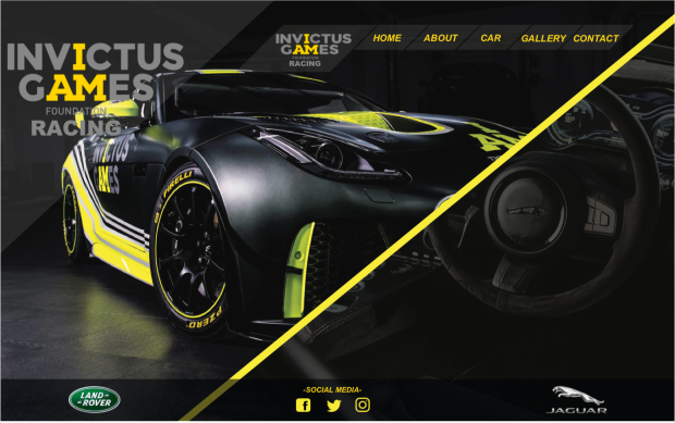
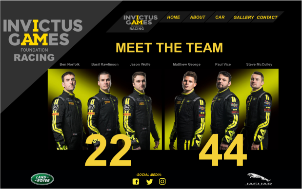
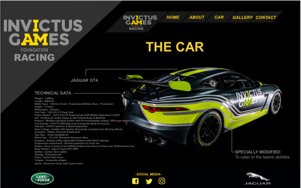
Looking back over my project I think that my designs fulfilled the visual communication requirements of the brief as we had to stick to a limited colour scheme used within existing Invictus games logo and designs. These colours included black, yellow and a lime green. To keep the continuity of the design throughout the website I made sure that these colours were used on all pages of the website as well as typefaces etc. The brief also stated that we had to create at least 3 pages of the website, my plan was to create a page for every subpage mentioned in the navigation bar at the top of the page, however, due to this being a short project I only managed to design 4. As I didn’t actually create my designs in a website building software I couldn’t state what kind of website my design was. In my head I always saw it as a parallax website meaning it’s continuous all on one page meaning you don’t have to get directed to different pages within the site.
One way in which I failed to meet the brief was that they wanted to see sketches of my designs however, I never actually got round to doing them as I started to run out of time. This was a vital thing I missed out and is defiantly something to improve on for next time. I strength of my design, is that it’s very clear and easier to understand with help from the well labeled navigation bar and because it is a parallax website system. I feel like if I had more time I could have developed my website further by making it a fully working website, finish all the pages and contain more information about the Invictus games etc.
Reflection of own working practices:
My time keeping for this task was okay however I could have managed my time a lot better as I think I spent way too much time on the research stage that I just rushed the design and development stages of the project. I feel like my analysis of the brief was pretty good, I produced the required elements from light maker sticking to colour schemes preferred pages etc. I was also able to produce a web design to a high standard independently. Like I mention before I spent a lot of time researching and creating mood boards so I think that this part of the project was a strong part for me. I was able to experiment with ideas by creating a mind map long with the mood board this helped to generate and develop ideas for the website. I really enjoyed designing something different as I’ve never done car or sport based design before so I really enjoyed this part of the project. However, one part of the project that I didn’t enjoy was the short deadline and trying to use muse to create my website. I’m not a fan of web design and I don’t really enjoy it so doing this against a short deadline really wasn’t my cup of tea, however it’s a learning curve for me as a graphic designer.
Good Design:
If I’m honest I didn’t really think about the sustainability of this project as it all happened so quickly, I used a lot of energy on computer as I spent a lot of time building the design. No paper was wasted as this would be viewed digitally no prints were needed. For my next project I will make sure I consider what sustainable impact my design might have. As this project is all about cars, this could be seen as unethical as they cause so much pollution. However, as this is to help and support veterans and amputees this is seen as supporting and helping those who have fought and served for our country.